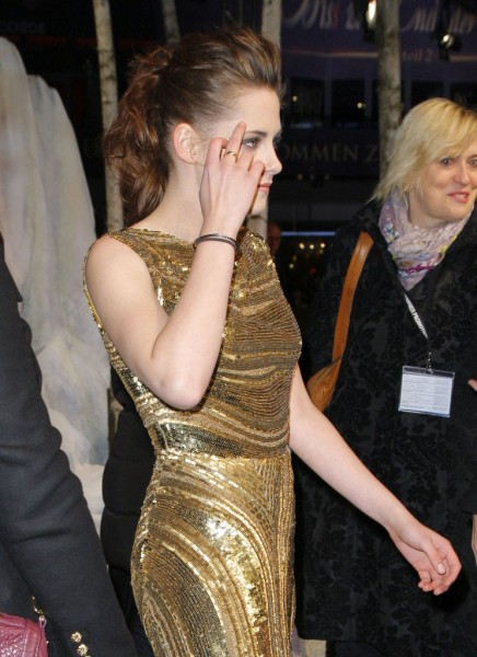
There’s no end in sight. Magazine editors have an obsession with photo editing celebrities until there’s nothing left of them to see. The mass media and the majority of society decided that being stick-figure thin is the epitome of beauty, class, and femininity. They couldn’t be further from the truth. On the cover of the new issue of Marie Claire Australia, Kristen Stewart appears gaunt, fragile and as thin as a straw in a water tasting factory.
On the now infamous cover, Stewart half-smirks with a ghastly, lifeless look in her eyes. It’s all fine and dandy when someone is not symmetrical – in fact, this makes someone much more attractive – but Stewart’s asymmetry seems to be more a symptom of poor photo editing than anything else. Her right eye is slightly larger than her left one, which not only makes her face appear lopsided and misaligned, but also air-brushed and emaciated. Her perky nose, which is one of her best features, seems to have lost much of its width during the photo editing. Even her flawless skin appears to be one peel away from a robotic interior. Her hair is pulled away to the side and clumped together on her shoulder, taking away any type of volume on the right side of her face, making it appear even less realistic.
Stewart might not be a classy and elegant lady, but she’s definitely one of the most beautiful females in Hollywood. Her strong jaw-line and prominent features ignite the silver screen, and her emerald green eyes stare down even the most hardened of Stewart critics. It is a crying shame that someone with such apparent beauty and potential could be so down-graded and withered by a trigger happy photo editor.
What do you think? Do you think the Kristen Stewart photoshopped cover went wrong in the editing room? Or do you think it looks perfect as is? Let us know your thoughts in the comments below.
Photo Credit: API/FAMEFLYNET


